Overview
Heat mapping is the practice of representing data where the individual values of a dataset are shown using colors. Heat maps are useful in a large number of applications, the most common of which is weather mapping. Location data from the CUWB system can be run through analysis and used to generate a variety of maps representing useful output. The following sections describe the use of heat mapping to indicate probable locations, probable pathways, and probable destinations.
Position Heatmap
Probable Locations
The position heat map is calculated using Kernel Probability Density in two dimensions. Position data from the CUWB Network is summed into a map using a standard deviation bubble. The illustrations below show an example of a single point added to a heat map, then subsequently two and three points added to the same map.
 Illustration 1: Single Point Standard Deviation 'Bubble'
 Illustration 2: Two Points Standard Deviation 'Bubble'
 Illustration 3: Three Points Standard Deviation 'Bubble'
Position heat mapping is useful to indicate potential locations for devices on a network. Adding each point into the map using a normal distribution around the point allows for users to analyze the location data to find the most probable location, or locations, for a given device or set of devices. For example, a user wishing to analyze the accuracy of a particular location could set a single device in a known location and record data for that device over time. Using the heatmap tool the user could then visualize the most probable 'center' location for that single device.
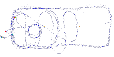
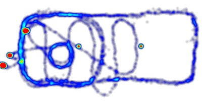
CUWB Network position data can also be run through the heat map tool to generate areal maps showing the most probable locations for a device. In the following illustrations moving points were added to the map. In the first example the data was added with a smaller standard deviation creating a map with thin lines. In the second illustration the same data was added with a slightly larger standard deviation to show how the data can create 'road map' like output for the probable locations.
 Illustration 4: HeatMap of Moving Data Using 0.030 Meter Standard Deviation
 Illustration 5: HeatMap of Moving Data Using 0.100 Meter Standard Deviation
Path Map
Probable Pathways
In the Heatmap analysis described above there is an outsize influence for a device sitting at a static location. Note, in Illustrations 4 & 5, the red dots located on the left of the image as well as in the center. These are hot spots in the probability distribution. They are hot (or likely locations) because a single device stayed in that location for a period of time. The Path Map is evaluated using methodology similar to the heatmap while eliminating the hot spot issue.
A 'path' in this context is defined as all contiguous position reports from a single tracked device within the area of interest. Paths are gathered from the Position data, expanded by the provided standard deviation, and added to to the map. No single path can have more influence on the map than the peak value of its standard deviation curve. A device can 'stop' along a path without influencing the map more than if it passed through the same location.
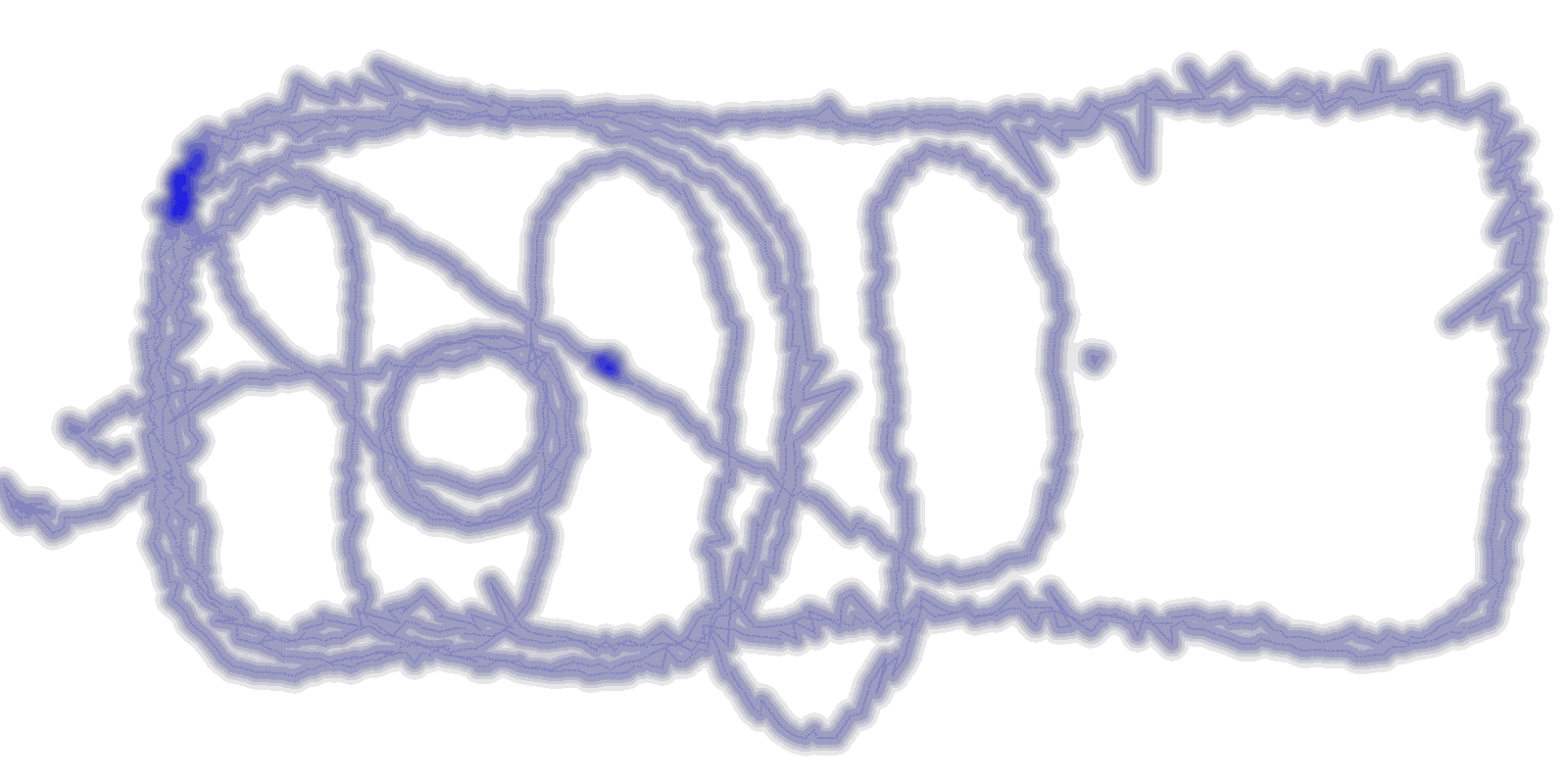
In the Illustration 6 & 7 below a Path Map is generated using the same data used for Illustrations 4 & 5 above. Note that the 'hot spots' are gone from the map. This map has a more uniform contour color because most of the data was added from one device along a single path. Unlike the Heat Map, the Path Map contour is not elevated when the device crosses over it’s own path.
 Illustration 6: PathMap of Moving Data Using 0.030 Meter Standard Deviation
 Illustration 7: PathMap of Moving Data Using 0.030 Meter Standard Deviation
In Illustration 6 & 7, small elevations can be seen the upper left hand corner. This is an area where a second device path was added to the map, thus elevating the contour in the areas where it overlapped with the first device. In Illustration 7, the standard deviation was increased and we can see that there is another device near the middle of the area that also elevates the path map contour.
Path Maps show the most likely path a device can take in a CUWB Network without over emphasizing areas where devices tend to linger. Given enough data the path map output can show a real-world map of the potential paths, or roads, that a device is likely to travel along. This data can be used to identify obstructions, analyze common behavior between devices, etc.
Dwell Time Map
Probable Static Destinations
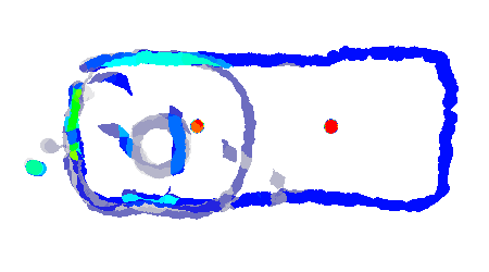
Dwell Maps are generated using position data from CUWB Networks and show the average time a device spends in a given area. The dwell map is generated by evaluating an area of interest over a grid. At each grid point the device dwell times are evaluated for devices found within a small radius. The dwell times are combined to provide an average overall dwell time for the point. This is repeated for every point on the grid generating a contour map like the one shown in Illustration 8 below.
 Illustration 8: ContourMap of Moving Data Using 0.250 Meter Grid Point Radius
Illustration 8 was evaluated using the same data as the previous Heat Map and Path Map. In this Dwell Map there are two hot spot locations that have very high average dwell times. It turns out that the data contains two devices that are sitting static at those locations. It can also be noted that the moving device passes through the same location as one of the static devices and brings down the average dwell time for a portion of the area.
Dwell Maps are useful to identify areas where devices tend to stand still. In some systems these may be points of interest. In other systems they may constitute areas where travel of devices is periodically blocked. Where Path Maps show probable travel, Dwell Maps show probable destinations.
The CUWB System
Real-World Solutions
The CUWB system generates location data that can be analyzed over large scales and periods of time. For information regarding access to CUWB location data please visit the CUWB Documentation Site.
Ciholas has worked closely with the Museum of the Bible to bring cutting edge location technology and analytics to create an experience unlike any other in the world. For examples of analytics data from the museum please see our Case Study.
Ciholas also works with clients develop custom installations and analytics solutions to meet their needs. Please visit our Custom Design page for more information.
